Guide
Why Screen Colors and Embroidery Floss Can Look Different
The short answer
Screen colours and embroidery floss differ because screens emit light while thread reflects it, every screen and printer reproduces a different range of colours, thread has sheen and texture that change with viewing angle, and two colours can match under one light but not another. Treat chart colours as a guide and choose floss by eye in daylight.
You convert a photo, the chart looks perfect on screen, you buy the threads, and the stitched piece looks… different. Duller in places, brighter in others, the skin tones a little off. This isn’t a mistake in the chart. It’s physics. Understanding why helps you choose threads that look right on fabric rather than chasing an exact match that can’t exist.
1. Light from a screen versus light off a thread
A screen emits light. It mixes red, green and blue light to create colour, and it can look brighter than the room around it. Thread reflects whatever light falls on it. A deep saturated blue on a backlit screen has no exact equivalent in cotton fibres that can only reflect part of the room’s light.
2. Every device has a different gamut
The range of colours a device can show is called its gamut. Phones, laptops, monitors and printers all differ, and so do dyed threads. Your laptop may show a vivid orange that your printer turns brown and no thread reproduces exactly. Colour values in a chart (we show each colour’s RGB hex code) describe what the screen should display, not what the thread is.
Even two screens disagree: brightness, night-mode warmth and calibration all shift colours. That’s why our charts call DMC codes “nearest” suggestions and never claim a screen colour is an exact thread.
3. Metamerism: matching under one light only
Two colours can match under one light and differ under another. This is called metamerism. Floss chosen under warm evening lamps may look different in daylight, and a green that matched in the shop may look bluer at home.
Practical rule: choose and compare threads in daylight near a window, and if the finished piece will hang somewhere specific, check them under that light too.
4. Sheen, twist and texture
Stranded cotton has a sheen that catches light differently depending on the angle and stitch direction. A block of cross stitches is textured, with tiny shadows between stitches. Together these make stitched colour look a little darker and richer than a flat colour swatch. Metallic and variegated threads are even less predictable.
5. Neighbouring colours change what you see
The eye judges colours relative to their surroundings. A mid-grey looks lighter next to black and darker next to white. In a stitched piece every thread sits next to others, so colours shift visually compared with the isolated swatches in a key.
6. Printing the key adds another step
A printed key passes through your printer’s own gamut and paper. Treat printed swatches as labels, not colour references.
How to choose threads with confidence
- Use the chart as a map of lightness and hue, not as exact colour. The important thing is that your threads keep the same light-to-dark order as the chart.
- Compare floss to the photo, not to the chart, if you’re stitching a photo pattern. Look at the original subject.
- Lay all your threads side by side in the order of the key. Gaps and jumps in lightness are easy to see this way.
- Check in daylight, then under the light where it will hang.
- Stitch a small test patch of the most important colours (skin, eyes, sky) before committing.
- Recolour the chart in the Studio to match the threads you actually bought. Rename colours with your thread names so the printed key matches your stash.
How DMC suggestions work here, and their limits
Charts on this site start with custom RGB colours with plain descriptive names like “Light Peach” or “Forest Green”. Next to each one you’ll see the nearest DMC floss, picked from a published table of all 489 DMC six-strand reference colours (licensed CC BY 4.0) by the smallest perceived colour difference. You can also snap the whole palette to DMC in the Studio’s Threads tab, or tick “Use DMC thread colours” in the photo tool. Snapping replaces each colour with the reference value, and colours that land on the same thread are merged so you never buy the same skein twice.
Three things to keep in mind:
- A reference colour is a screen colour too. The DMC table describes how each thread is usually shown on screen, so it inherits every limit above: gamut, sheen and metamerism.
- “Nearest” is not “same”. The tools label each suggestion as a close, fair or loose match. A loose match means no DMC thread is near that screen colour, which often happens with very saturated photo colours. Check those by eye.
- Neighbours matter more than individual matches. Two chart colours sometimes snap to the same thread. That’s usually fine; when it isn’t (eyes, highlights), choose a slightly lighter or darker code by hand in the Colours tab.
We never say a colour is a thread unless you chose it, and DMC is a trademark of its owner, not affiliated with this site. See how it works and licenses for the method and the data source.
Using the DMC codes when you shop
- Open the Studio’s Threads tab, check the suggestions and swap any loose matches for a code you prefer (search by number or by name, such as “salmon” or “310”).
- Set the number of strands you’ll stitch with. The list estimates skeins from the real stitch count and your fabric, and the same figures appear in the PDF key.
- Download the thread list (CSV) and take it to the shop, or print the PDF key.
- In the shop, lay the skeins out in key order and check the light-to-dark steps in daylight before you pay.
Common mistakes
- Buying threads from a phone screen in a dim room.
- Assuming the darkest chart colour needs the darkest thread available; keep relative steps instead.
- Ignoring fabric colour: the same thread looks different on cream, white or grey fabric.
- Matching each colour individually instead of checking the set together.
Use the automatic DMC suggestions as a shopping shortcut, then let your eye make the final call: you’re the one judging real threads in real light.
Worked example: matching a photo pattern to threads
You have a 14-colour tulip chart and a box of threads.
- Sort the key by lightness, from darkest red to palest pink, and do the same with candidate threads.
- Match by position, not by eye alone. If the chart has five reds stepping from dark to light, pick five threads that step evenly in the same order. Even if each individual thread isn’t a perfect match, the stitched picture will keep its shading.
- Check neighbouring pairs. Put each pair of adjacent shades side by side in daylight. If two look identical, either pick a different thread or merge those colours in the Studio.
- Test the extremes. Stitch a few crosses of the darkest and lightest colours on a scrap of your fabric. These two set the contrast of the whole piece.
- Update the chart. Recolour and rename the chart colours to the threads you chose so the printed key matches your stash.
Lighting checklist
| Situation | Effect on colour |
|---|---|
| Warm indoor bulbs | Reds and yellows look stronger; blues look duller |
| Cool daylight | The most neutral for choosing |
| Direct sun | Sheen and highlights exaggerated |
| Phone screen at night (night mode) | Colours shifted warm; avoid choosing threads this way |
The role of fabric colour
The same thread looks different on white, cream, grey or black fabric. If you stitch on coloured fabric, compare threads while holding them against that fabric, not against white paper.
Questions stitchers ask
Can a website give exact thread colours?
No screen-based tool can guarantee a match, because screens emit light, thread reflects it, and both change with lighting. Thread charts help, but the final check is always by eye.
Why does my printed key look different from the screen?
Printers use inks with their own colour range, and paper changes how colours appear. Treat the printed key as labels, not colour references.
Which light should I use to choose floss?
Daylight near a window is the most neutral. Then check the threads under the light where the finished piece will hang.
How do I keep my key matched to my threads?
In the Studio, recolour and rename each chart colour to match the threads you bought. The printed key then shows your own thread names.
Try it now
Everything in this guide works in the free cross stitch pattern maker, right in your browser, with no account.
Recolour a chart in the Studio →A pattern to practise with
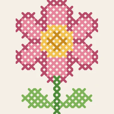
Garden Flower
A pink bloom on a stem with two leaves, 13×18 stitches.